Yesterday morning, I was scrolling through a BookBub email when a cover stopped me.
This is worth mentioning because the book wasn’t in a genre I normally read. I wasn’t looking for it. I didn’t recognize the title. I wasn’t particularly interested in buying another book.
But I stopped scrolling. I looked at the cover closely enough to wonder about the artwork. Then I read the blurb.
I didn’t buy the book in the end, for reasons that had nothing whatsoever to do with the cover or the blurb. I recognized the series character and remembered that I’d tried the series before and it wasn’t for me.
But the cover had done its job magnificently. It had taken me from:
scroll → stop → look → read.
A little farther down the same email was another cover. It was beautiful. Professionally executed. Perfectly readable at thumbnail size. It communicated its genre instantly.
And I barely saw it.
I knew what it was before I’d consciously looked at it. Oh. Another one of those. <Scroll>.
And that got me thinking about something we’ve been teaching indie authors for years.
We Learned the Lesson Very Well
One of the standard rules of indie publishing is that your cover is packaging.
It isn’t primarily a work of art. It isn’t there to express your individuality as an author. And it certainly isn’t the place to indulge your personal aesthetic preferences regardless of what readers expect. The cover has a commercial job to do.
Readers should be able to look at it and understand what sort of book they’re being offered.
So we study the bestselling books in our categories. We identify the visual conventions. We brief our designers accordingly.
If dark backgrounds, elaborate serif typography, jewel tones, flowers, crowns and edged weapons dominate successful romantasy covers, those elements tell us something.
If women’s WWII historical fiction features women in period clothing, railway stations, European streets, aircraft, suitcases and dramatically saturated skies, that’s useful market information too.
The advice isn’t wrong. In fact, it was a necessary correction to the days when indie authors commissioned the cover they wanted rather than the cover that sold the book.
We’ve simply become extremely good at following the new rules. Perhaps too good.
The Problem with Being Instantly Recognizable
Consider these two completely fictional books and authors I had AI create for this post.
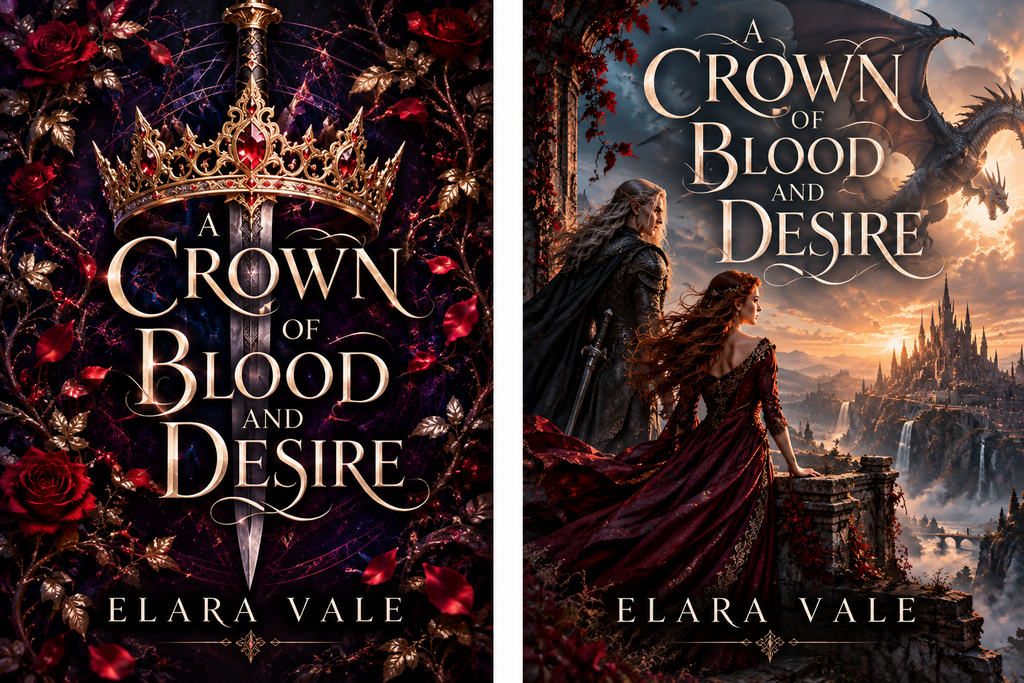
The cover on the left does exactly what we’ve been telling authors their covers should do. It’s attractive. Professional. On trend. More importantly, I can identify its commercial category in a fraction of a second.
Romantasy. Mission accomplished.
Except I would scroll straight past it.
I’ve seen so many variations of that visual vocabulary that I’m almost blind to it now. I don’t need to examine the crown, sword, roses or typography individually. My brain has learned to compress all those signals into a single piece of information:
Romantasy.
And having successfully categorized the book, it can move on.
Now look at the second cover. It still says romantasy. We haven’t sacrificed the genre signalling at all. But there are people on it. There’s a castle in the distance. There’s a dragon overhead. The characters appear to be looking toward something.
Suddenly I have questions. Who are they? What’s their relationship? Is that where they’re going? Is the dragon a threat? What’s about to happen? There is the suggestion of story.
Now let’s try a genre at the other end of the bookstore.
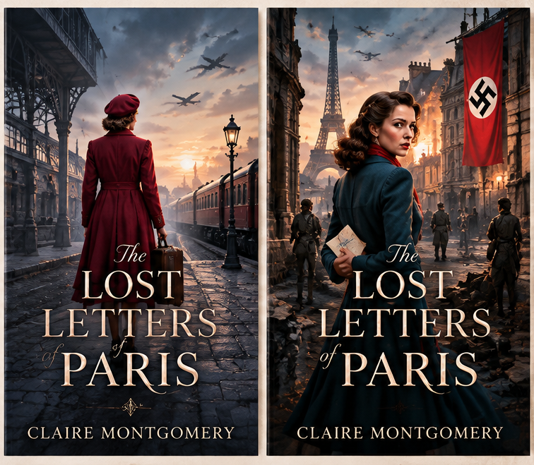
I have the same reaction. The first cover is instantly legible. Woman. Period clothes. Suitcase. Train. Aircraft. European setting. Oh. Another WWII plucky heroine.
And I’m gone.
The second still communicates exactly the same genre. But now the woman is looking over her shoulder. She’s holding something. There are people behind her. Something appears to be happening. Most importantly, the image suggests emotion.
And that may be the bit we’ve lost sight of.
A Cover Has More Than One Job
We talk endlessly about genre signalling because a cover needs to perform this job: Recognition: This is my kind of book.
But I think there are at least two more jobs.
Interruption: Wait. What’s that?
And:
Enticement: I want to know what’s happening.
The trouble is that extreme conformity can make the first job work against the other two. If I can identify a cover without really looking at it, then I’ve successfully received its genre signal. But the book hasn’t necessarily received my attention.
Those aren’t the same thing.
Familiarity Can Become Camouflage
Think about what camouflage actually does. It makes something resemble its surroundings closely enough that your eye passes over it. Which is uncomfortably close to what we’ve been telling authors to do with their covers.
- Study the twenty bestselling books in your category.
- Make sure yours looks as though it belongs beside them.
- Don’t be too different.
- Don’t confuse the reader.
All sensible advice.
But if you put your book beside twenty other books using almost exactly the same visual vocabulary, you’ve demonstrated very successfully that it belongs there. You may also have made it difficult to see.
This isn’t an indie-only problem, either. Traditional publishing does precisely the same thing. A cover style succeeds, other books adopt variations of it, readers learn the visual vocabulary, and eventually the convention becomes ubiquitous.
There’s a predictable cycle:
- A cover treatment attracts attention.
- It succeeds.
- Other books adopt it.
- Readers learn what it means.
- It becomes an efficient genre signal.
- More books use it.
- Eventually readers become so familiar with the pattern that they can identify it without consciously processing it.
The thing originally designed to attract attention has become extremely good at allowing the brain to skip attention.
The Scroll Has Changed the Equation
I also wonder whether some of our cover wisdom hasn’t fully caught up with the environment in which readers now encounter books.
Think about how many covers readers see. Amazon search results. Also-boughts and recommendation carousels. BookBub emails. Facebook and Instagram ads. Social media posts. Newsletters. Kickstarter campaigns. Retailer emails.
Cover after cover after cover, usually displayed at thumbnail size and processed in seconds.
We’re not merely competing against books from other genres. We’re competing against habituation. A visual device can continue to communicate perfectly well after it has stopped attracting attention. In fact, the more familiar it becomes, the more efficiently the brain may categorize it.
And then ignore it.
Pretty Nouns Versus Story
There was another difference I noticed when I compared the fictional covers. The generic covers are largely collections of nouns.
- Crown.
- Sword.
- Roses.
- Woman.
- Suitcase.
- Railway station.
They’re beautiful nouns. They’re extremely well-rendered nouns. They’re genre-appropriate nouns. But they don’t necessarily make me feel anything.
The other covers imply verbs.
- Someone is watching.
- Someone is travelling.
- Someone is waiting.
- Someone is hiding something.
- Someone is confronting something.
- Something is about to happen.
They imply relationships, danger, desire, fear, uncertainty. In other words, they imply story. And fiction readers aren’t actually shopping for crowns, roses, railway stations and women in red coats.
They’re shopping for stories.
More than that, they’re shopping for emotion.
Which makes me wonder whether, in our determination to make covers excellent tools for categorizing fiction, we’ve sometimes stripped away the very thing we’re trying to sell.
This Does NOT Mean “Make Your Cover Different”
I can already hear someone taking this argument to its logical but completely unintended extreme.
No. I’m not suggesting that you throw away genre conventions.
Please don’t commission an austere black-and-white typographic cover for your dragon romantasy because you want to stand out. And we’re definitely not returning to the days of, “But this image speaks to my soul and perfectly represents Chapter 17.”
Your cover still has to make the correct promise. A reader who loves your kind of book should be able to recognize that your book might be for them.
The distinction I’m suggesting is: Genre familiarity at the category level. Individuality at the book level.
Or, perhaps: Don’t violate the genre vocabulary. Say something new with it.
The second fake romantasy cover still looks like fantasy romance.
The second fake WWII cover still looks like women’s historical fiction.
They haven’t abandoned the language readers understand.
They’ve simply used that language to say something more specific than Here is another book in this category.
Add Another Question to Your Cover Brief
So the next time you’re designing a cover, commissioning one, or evaluating concepts from your designer, don’t stop with the usual questions.
- Does it look professional?
- Does it communicate the right genre?
- Would it look at home beside successful books in my category?
Those questions still matter. But perhaps add a few more.
- What makes someone look at this cover rather than merely categorize it?
- What belongs to this particular story rather than simply to this genre?
- Does the image imply something happening?
- Does it suggest an emotion?
- Does it make the reader ask even one tiny question?
And here’s one I’d really like to start using:
If I put this among twenty current bestselling covers in my genre, can I still find it?
Because perhaps the ideal cover shouldn’t look out of place among those twenty books. But it shouldn’t disappear among them, either.
First, Make Them Stop
That BookBub cover that started all this didn’t sell me the book. It couldn’t. I already knew something about the series that ultimately made me decide against buying it. But before any of that could happen, the cover made me stop scrolling.
Then it made me look. Then it made me read the blurb.
The cover gave everything else—the title, the description, the author, the series, the price—a chance to do its job. And that’s all we can really ask a cover to do.
We’ve spent years asking: Will readers know what kind of book this is?
I think it’s time we added another question: Will they actually see it?
Now Available.

The Anti-Ensh*ttification Field Manual for Indie Authors:
Because the platforms will decay…but your career doesn’t have to go down with them.
Now Available.
The Indie Author Survival Guide
How to Stay Profitable, Productive and Sane in a Tougher Market
Now Available.

The Productive Indie Fiction Writer: Strategies for Writing More, Earning More, and Living Well
Write More, Faster Than Ever Before | Are You Prolific?
Editing Your Next Novel? Mark Posey offers fast, writer-friendly edits with zero drama. Check out services »